In my design career I've made a thousand million poor design choices. But that's called learning :) I will say that finding that perfect, harmonic design balance is something I still find myself struggling with even as I progress through all I learn.
A big part of this
finding balance was discovering
harmony with fonts. Now, Five Sixteenths has featured a whole load of different fonts over the course of it's life time and while I really love blogs that seem to be able to pull off using many assorted fonts, I've finally decided to use just a few here on 516. Today I want to share with you
5 simple font pairings for your blog, invites, or any other text based project. These tips sort of go off of the new
DIY blog design (check out the old design
here) & how fonts create a
look for your blog.
You can learn how to take a complete blog design from start to finish -including what serif & sans serif fonts say about your design- in the
Blogging Basic eBook released earlier this September
Paring Fonts:
Pairing two fonts together, let's do this! The bigger font in the examples below is intended for your header or post titles & the smaller font is intended for your post body.
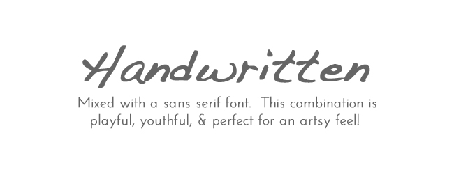
Handwritten + Sans Serif
Dakota & Josefin Sans
Sans Serif + Different Sans Serif:
Bebas Neue & Josefin Sans
Sans Serif + Serif
Caviar Dreams & Didot
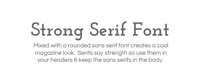
Strong Serif + Rounded Sans Serif
Josefin Slab & Questrial
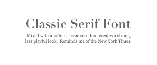
Classic Serif Font + Another Classic Serif Font
Didot & Georgia
One more tip: Keep handwritten fonts in the header or post title of your blog. In these places, the font is big enough to see the words clearly. Handwritten or cursive fonts in a body of text at a small font size are incredibly hard to read!
Some of these fonts are built into the Template Designer here in Blogger & others are
Google Web Fonts you can use in your template through html. The great thing about the Template Designer is the ability to play with & pair fonts and instantly see the result in the preview! Since fonts give a lot to your design, consider how well they pair together & what you want the fonts to bring to the design.
I hope this made a bit of sense to you & helps you see how fonts work together!
What are your favorite fonts?